Make the primary text colour easier to read #22
Merged
Add this suggestion to a batch that can be applied as a single commit.
This suggestion is invalid because no changes were made to the code.
Suggestions cannot be applied while the pull request is closed.
Suggestions cannot be applied while viewing a subset of changes.
Only one suggestion per line can be applied in a batch.
Add this suggestion to a batch that can be applied as a single commit.
Applying suggestions on deleted lines is not supported.
You must change the existing code in this line in order to create a valid suggestion.
Outdated suggestions cannot be applied.
This suggestion has been applied or marked resolved.
Suggestions cannot be applied from pending reviews.
Suggestions cannot be applied on multi-line comments.
Suggestions cannot be applied while the pull request is queued to merge.
Suggestion cannot be applied right now. Please check back later.


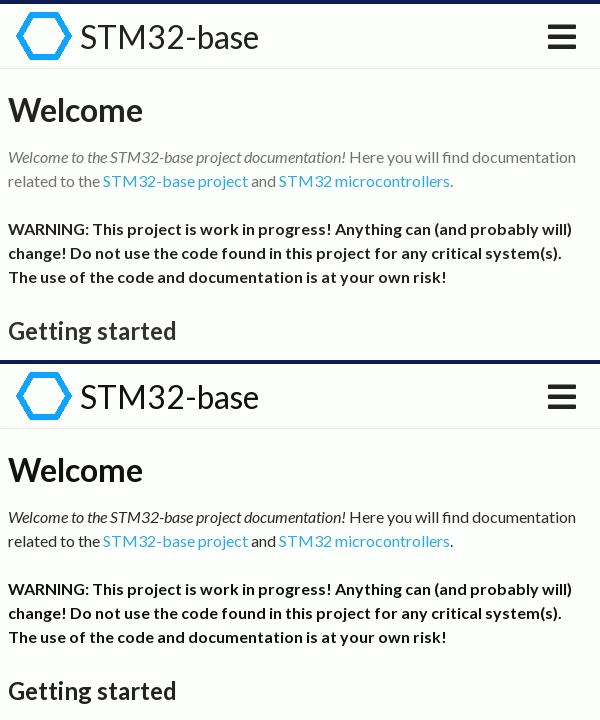
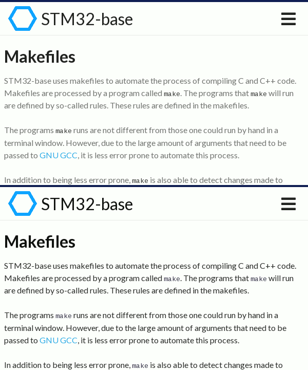
Currently the primary text is coloured in relatively light gray. This PR changes it to be substantially darker and, hopefully, easier to read.
The following picture presents three text colour variants:
#727272(current),rgba(0, 0, 0, 0.87)and#000000. This PR proposes#111111, which is somewhere between the latter ones.